
A sensitive geometry
Wigrum was born in 2011, when Anouk Pennel and Raphaël Daudelin, from Montréal-based design studio Feed, were preparing the book design for Daniel Canty’s latest novel. Canty, a contemporary writer from Québec, writes in Wigrum about a mysterious character who moves at the border between fiction and reality, between Second World War time and present time, between Eastern and Western Europe. To typeset the book, Studio Feed created Wigrum, a sans serif with strong references to geometrical sans serifs of the 1930s, and also to their current influence.
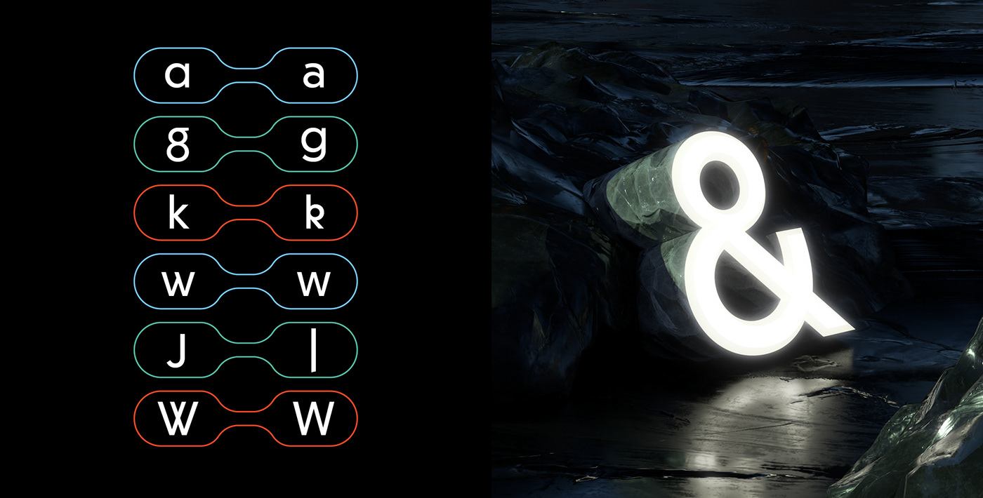
Wigrum is especially representative of its designers’ will to add a “humane” tone to geometry. Thus, Wigrum features include straight, rational shapes, and at the same time all the required optical corrections for optimal reading comfort. Plenty of personality remains, however, in various details and unusual shapes for ‘W’, ‘g’, ‘R’ and ‘S’. Feed frequently ventures into type design: for almost 20 years, they have made the practice an essential part of their unique approach to commissions. Wigrum was their first commercial release.
Wigrum was born in 2011, when Anouk Pennel and Raphaël Daudelin, from Montréal-based design studio Feed, were preparing the book design for Daniel Canty’s latest novel. Canty, a contemporary writer from Québec, writes in Wigrum about a mysterious character who moves at the border between fiction and reality, between Second World War time and present time, between Eastern and Western Europe. To typeset the book, Studio Feed created Wigrum, a sans serif with strong references to geometrical sans serifs of the 1930s, and also to their current influence.
Wigrum is especially representative of its designers’ will to add a “humane” tone to geometry. Thus, Wigrum features include straight, rational shapes, and at the same time all the required optical corrections for optimal reading comfort. Plenty of personality remains, however, in various details and unusual shapes for ‘W’, ‘g’, ‘R’ and ‘S’. Feed frequently ventures into type design: for almost 20 years, they have made the practice an essential part of their unique approach to commissions. Wigrum was their first commercial release.